This subject has opened my eyes to things i could never see before. In lecture one our class was introduced to our first movie title sequence to the James Bond films. The opening title sequence was created using minimal special effects. One in particular that caught my eye was a projector projecting text onto a girl dancing. It gave a great effect for a minimal cost. Also we were shown a scene of a girl wearing a bikini. I was unaware until Andrew pointed out that this was very out of the ordinary for those days. A female was always to be covered up. Movies allow us to show how history changes.
In lecture two the class was shown pieces of famous art by artists such as Van Gough and Warhol. Andrew explained how design needs crazy art in order to gain new audiences attention etc. He also explained how Art and Design can now be seen in combination with each other as well as separate. We were shown both Kylie Minogues and the white stripes film clips. Each were very different yet both were pieces of art with a lot of design preparation. Kylie's film clip needed to be filmed and timed precisely before she came to set and the white stripes film clip would have taken months to prepare because of the Lego used.
Lecture three consisted of analysing cartoons such as Southpark, the simpsons and disney. Each are cartoons but each have different audiences. The class discussed what was entertaining about each as well as the audiences each would suit. It was made clear that all cartoons are not made for children and that cartoons need to be taken seriously.
Lecture four opened my eyes. I have always been a lover or fan of Disney movies up until now. Disneys "The Lion King" is no more then a rip off of the less famous Leo/White Lion by Tezuka. Tezuka used the technique known as animae. This later influenced many Western Countries future movies and animations. Its just dissapointing to know that a great artist like Tezuka could be under sold and his work taken from him. Other animations that we looked at was Betty Boop, Astro Boy and Mickey Mouse.
During lecture fives class we watched a short film called Cane Toad. In this short film we saw how an artist can still get the same effect or idea across to an audience by omitting small details. This allows a viewer to fill in the blanks and also saves an artist a lot of time.
Lecture six explored different advertising. We looked at adverts such as XXXX, sony erikson, pirelli and one of my favourites odyssey jeans. Each of these adverts are so different from what we see in Australia. They are more like short films then they are advertising. I never really liked adverts but after watching these types i have become interested in finding more. This week we learnt what the meaning of graphic really is.
In Lecture seven the class looked at Hyper realism, animation and motion graphics. Some examples that were discussed were the channel 1o logo, pop eye and the driving school animation. It was interesting to see how a simple animation such as Driving school could create so much entertainment.
Lecture eight started with Andrew making two of the students being put up the front of the lecture with a video game. Each had to work out how to play the game on their own. We then spoke about how video games are second nature to my generation whereas my parents generation have no clue on the basic controls of video games. This is because my generation has had this technology since birth. We have been taught the basics in school etc.
Lecture nine explored the use of music in movies etc. Incidental music and sound effects increase a scenes purpose or effect on the audience. Quick sharp sounds in action scenes help create the drama in a scene. Without the music a scene wouldnt have the effect it does on its viewers.
In lecture ten we were introduced to hi-res (a London based studio who push boundaries). We were also introduced to Graham Miltons work. The class watched both short clips with each companies work (in short clips linked together). I have never heard a class so quiet. It was incredible to see the work that can be achieved with the use of flash and adobe products. It was also interesting to see how quirky and un-conventional ideas can be eye catching and can gain future work. I now know that things don't have to make sense in order to gain attention and gain respect. Many ideas flew to my head for things that i could possibly do for my own future work.
This class has opened my eyes to the world of multimedia. I am now more aware of what a Multimedia Artist can do. Its exciting to see what i will be capable of doing by the end of the course and i cant wait to learn more.
Thanks Andrew, great class with interesting topics that made me want to find out more information about Multimedia Design.
Sunday, June 8, 2008
SCOTT McLOUDS UNDERSTANDING COMICS THE INVISIBLE ART
CHAPTER 9
This chapter is a summary of the previous 8 chapters. Each chapter is listed below with a basic summary.
Chapter 1 – Explains how comics are more then cartoons. He also explains how not all comics are for children’s eyes and how more and more comics are for adult audiences (because of the themes etc)
Chapter 2 – Scott discusses sequential art and how simplistic lines can represent a face etc. He explains how these simple lines etc can be interpreted in different ways with different viewers. I
Chapter 3 - This chapter explains how people are made to use their imaginations. Scenes are omitted by an artist for a reason. Not only does it save time for an artist to create but it allows a viewer/reader to fill in the blanks.
Chapter 4 – discusses how time and movement can be shown in comics with the use of lines, captions and frames.
Chapter 5 – Talks of line weights, and how these line weights depict different emotions. For example. Dark bold lines represent anger etc.
Chapter 6 – Explains how comics are not just pictures. Comics can be pictures, words or a combination of both.
Chapter 7 – Describes the six steps to creating a great comic. (Ideas/ Purpose, form, idiom, structure, craft and surface)
Chapter 8 – Discusses how colour has changed the way we look at comics. It also questions comic books content. Would you buy a comic which is colour on the surface with no great content or a plain black and white comic with purpose?
This book has changed the way I look at comics by giving me a better understanding of how they are created and their importance. I was never much of a fan of comics but now I have more respect for them and the artists who create them.
Tuesday, May 20, 2008
UNDERSTANDING COMICS THE INVISIBLE ART - SCOTT MCLOUD
CHAPTER 8 - A word about Colour
This chapter, as its' title says, is purley about colour in comics. Colour in comics allows a person to feel more emotions or associate particular colours with characters. Colour was first introduced into comics that would appear in newspapers. It was there to draw attention from everything else in the paper and for that it cost more money to print. Thus creating a profit for the papers. So was colour introduced for a readers benefit and better understanding of a comic or purely for making money? I believe it was mainly for making money for comics that did not really get a second look in the paper.

(The above image was taken from blogs.ign.com/.../2008/04/17/87043/Controls/)

(The above image was taken from www.geocities.com/batmanmagazine/nftc8.htm)
Lets use the above two pictures as an example. Ok so if you walked into a comic book shop and you were trying to choose between a the coloured comic and the black and white comic what would you choose? Would you go for content or surface value. Most people would first be drawn to the coloured face comic as it attracts your attention at first glance. I suppose it's just up to a reader to decide what they truely wanting from the comic in question.
This chapter has opened my eyes to a comics true value. If i ever read a comic it always had to have colours in it, to me black and white comics did not exist. Shame on me because the comics that i did read were really poorly written and i had seriously wasted money. From now on i will always look at the content of a comic/video/game before judging it and making my decision.
Monday, May 19, 2008
UNDERSTANDING COMICS THE INVISIBLE ART - SCOTT MCLOUD
CHAPTER 7 - THE SIX STEPS
Scott McLoud speaks of the six steps in comics. These steps are Ideas/purpose, Form, Idiom, Structure, Craft and surface. Basically these steps act as a guide for comic artists and should be followed in order to create a fantastic comic. If you skip steps then things may appear to be fine on the surface but the ideas and form can be miss interpreted.


(The original comic book cover above was taken from http://en.wikipedia.org/wiki/Spider-Man, the spiderman 3 cover was taken from www.criticsrant.com)
An example of a comic appearing great at first glance is the Spiderman 3 movie, (although this is a movie it still can be used as an example of a good comic gone bad). At first glance a viewer would think this is going to be awesome, another Spiderman movie. But then once a person gets involved into the movie they realise that the movie is more special effects and more about romance then it is about destroying evil villans. Therefor the original "comic" has been changed and its content is not as good as what it used to be.
Why try to fix something or create something from the old, if the old works?
In my opinion a designer should remember these six basic steps for a successful comic. One must remember that although something can look amazing at first glance it doesnt neccessarily make it a great.
Wednesday, May 14, 2008
CHAPTER 6 - SCOTT McLOUDS UNDERSTANDING COMICS THE INVISIBLE ART
Chapter 6 - Show & Tell


This chapter explains how comics can be pictures, words or a combination of both. Below is a comic that i found at http://en.wikipedia.org/wiki/Comics. I have edited it to show you exactly how the best comics use a combination of both text & pictures.
The comic above shows a picture of a toddler whome we assume is either screaming or sneezing due to the movement drawn in the comic. Though it is unclear exactly what the toddler is doing.
The frames below are the text part of the above comic. We as the reader have to use our imagination to figure out what the words are describing. Although the obvious would be a sneeze as the words that describe the sound of a sneeze are used.
Now when we combine the text and the pictures to form this comic, we get a clear understanding of what the comic is about.
So whilst the combination of words and pictures in comics give us the reader a clear picture of what is actually happening, there are situations where by ommitting either words or text the reader is forced to interperate the comic in their own way. The author is making a user think rather then telling them what to think.
CHAPTER 5 - SCOTT McLOUDS UNDERSTANDING COMICS THE INVISIBLE ART
CHAPTER 5 - Living in Line
After reading this chapter i found that you can express emotions & Actions through the use of line work and symbols.
Generally darker lines represent emotions such as anger, fear, anxiety, madness etc whilst soft thin lines represent emotions such as calm, reason, honesty, innocence and youth etc. Below are two examples of different line work. One is darker and the other uses a softer line type.

(Comic taken from http://www.comics.com/)
As you can see this comic comes across as innocent and honest due to the simple drawings and thin lines that have been used. Where as the picture below has bolder lines with a lot more detail which gives off the impression that the comic is probably for older readers and slightly aggressive.

(image taken from http://hem.passagen.se/fm4/sincity.html)
Symbols also play a part in showing emotion. One of the most commonly used symbols would probably be the love heart. It represents love, attraction, lust, happiness etc. Below are some examples of Symbols which are commonly used in comics today.
 (The image above was taken from http://www.dreamstime.com/jpeg-comics-symbols.-image4048668)
After reading this chapter it made me realise how important symbols and line weights/types are in the comic world. They really help sell an emotion or a theme to a reader.
Sunday, May 11, 2008
CHAPTER FOUR - Scott McLouds Understanding Comics the Invisible Art
Chapter 4 - Timeframes
After reading this chapter I have learnt that time can be shown/represented using a number of techniques. For example silent panels, panels with captions, numerous panels with slightly different movements etc. Time and motion can also be shown through a series of events and frames. Below is an example of motion: The ripple lines represent the character slowly moving into the water. You also know that time has passed because the first panel shows the lady getting into the water where the last frame shows her half way in the water. So you know time has passed for her to walk in.

After reading this chapter I have learnt that time can be shown/represented using a number of techniques. For example silent panels, panels with captions, numerous panels with slightly different movements etc. Time and motion can also be shown through a series of events and frames. Below is an example of motion: The ripple lines represent the character slowly moving into the water. You also know that time has passed because the first panel shows the lady getting into the water where the last frame shows her half way in the water. So you know time has passed for her to walk in.
(Picture was taken from http://www.comics.com/comics/chickweed/index.html)
In this chapter Scott McLoud explains how time can be shown in comics through the use of panels. An example of this is a frame of a stop watch. Then next to it is another frame of a stop watch with time is shown later than the first. This makes us believe that time has passed. Another example of this is shown below.

(This comic was taken from http://www.comics.com/comics/peanuts/)
In this comic time has passed. We know this because of the captions. They use words such as "I throw my marble" then they use another caption a couple of panels later saying "i missed". Also we can tell that he has been hit by the girl because of the caption above saying WHOP and the movement lines around his body.
This chapter has made me realise that there are many different ways to show both time and motion in comics, and you can use more than one technique in a single panel to help give a sense of time and motion.
Wednesday, April 16, 2008
UNDERSTANDING COMICS - SCOTT MCLOUD
CHAPTER 3 - BLOOD IN THE GUTTER
In this chapter McLoud talks about information which has been omitted from comics for a reason. Information is sometimes deliberately left out of movies, comics etc to allow the reader/viewer to deceide what happens to a character/situation etc on their own. A good example of this is in the Short film we watched in class a couple of weeks ago. It was about how cane toads are going missing (because of the culling of toads on the borders in Australia). Anyway in this short film the main character is talking about his mate who goes missing and he starts describing different reasons for his mate being lost. One of the scenes shows his mate jogging on the spot and the main character explains how he loves his sports. Then a massive golf club comes into play and the mate gets hit with the club. Now although we see direct contact between the golf club and the toad there is nobody actually using the club to hit him. It has been omitted. Thus because the viewer automatically fills in the blanks that someone is using the club. Another scene shows the toad looking for directions and then a truck is shown. The next screen shot shows the toad squished into the road as if he has just been run over. Now we dont see the toad being run over but we can safely assume that he has been.
By omitting scenes we are allowing a viewer to fill in the blanks of what happens next, it also allows us the artist to do less physical work and yet still get the same result. So Scott McLoud is trying to tell us that by omitting detail we still can have the same effect on our readers/viewers and save a lot of time.
Wednesday, March 26, 2008
UNDERSTANDING COMICS - THE INVISIBLE ART
CHAPTER TWO - THE VOCABULARY OF COMICS
Comics deserve a lot more credit then what people give. I should know because i never used to be interested in comics at all. To me they were to hard to relate to probably because back then i used to just read the words and not briefly look at the pictures. I mean i would see the picture but not really see it.
After reading Chapter two of "Understanding Comics - The Invisible Art" Scott McCloud gives a clear understanding of what your brain actually sees when reading comics or looking at sequencial art. He explains how you dont have to see really detailed pictures in order to understand what they are. For example he shows a picture of a detailed picture of a guys face then a picture of a circle with two dots and a line (which represent eyes and a mouth). Although the second picture is much more simplistic we still recognise it as a face, possibly our own.

(Picture was taken from http://en.wikipedia.org/wiki/Osamu_Tezuka)
Also in this Chapter Scott McCloud talks of the work of many artists including Osamu Tezuka (picture shown above), famous in Japan for his comics as well as his hit television cartoon series Kimba the White Lion.
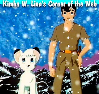
(image taken from http://www.kimbawlion.com/)
Kimba the White Lion was the first coloured animation on tv and it was so popular that it was bought by many other countries. This cartoon series was created mainly for the younger viewer. You can tell this from the way the characters speak to each other as well as looking at how the characters are created. Osamu orginally took his inspiration from other famous artists work, for example Walt Disney's mickey mouse character, but he created his cartoons using a style known as Manga. Its a shame to know that Walt Disney's - "The Lion King" was a rip off from Osamu Tezuka's famous series "Kimba the White Lion". But "The Lion King" has been produced in a different way. The storyline is still similar but the overall target audience is both children and adults alike. Walt Disneys animations are much more detailed and flow much like a movie.
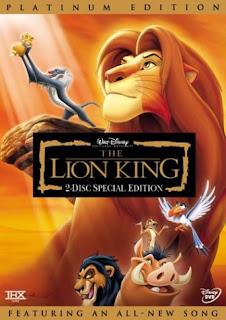
(Picture was taken from www.teachwithmovies.org/guides/lion-king-DVDc)
This takes me back to "Understanding Comics - Chapter 2". McCloud mentions the fact that Disney have been producing animations for over 50 years with a lot of detail in backgrounds and less detail on the characters themselves. This has been done so that the viewers attention is shifted. Obviously the more detailed the background/object or character the more the artist wants us the viewer to know about that particular thing. If a character etc is created with little detail then the artist wants us to make that character or thing our own. They want us to not so much put ourselves into that position but give us more possibilites for what could happen. This can also be found in many Japanese cartoons as well (they do this very well).
Therefore after reading the second chapter to McClouds "Understanding Comics" i have come to realise that if there is more detail either in a peice of art or a movie or a comic, its there to draw us in. We need to focus on that detail as its an extremely important thing. Also its the same for less detail. There is less detail because we must create that detail ourselves in our minds.
Tuesday, March 25, 2008
UNDERSTANDING COMICS - THE INVISIBLE ART CHAPTER ONE
CHAPTER ONE - SETTING THE RECORD STRAIGHT
After reading the first Chapter of Understanding Comics - The invisible Art (By Scott McCloud), i now have a better understanding of what comics are and how they are easily mistaken for cheap childrens entertainment. When in fact this is not the case.
See when people think of comics they automatically think of cartoons. A lot of peoples first thoughts about cartoons are that they are for children only. I mean how can a cartoon be inapropriate for a child to watch? But there are a couple of cartoons which pop into my head that may look suitable for children but aren't exactly child friendly.

(image from http://www.southparkstudios.com/)
One being South Park. Athough the characters and settings are simplistically drawn (to look like a childrens artwork), the overall theme of the cartoon is violence and slander really. All they do is swear, mock religions, make fun of people etc. Don't get me wrong, and dont ask me why but its really quite amusing seeing a cartoon character die differently in each episode, and the topics for each episode are very crude. But this cartoon contains teenager and adult humour and really should not be seen by younger viewers.

(Image was taken from www.comedycentral.com/shows/drawn_together/ )
Another similar show is Drawn together which is also shown on SBS at a late time slot. Its basically about a group of cartoon characters/super heros that are all room mates in a "big brother" like house. This show has similar themes to south park and is yet another example of a Cartoon TV show that should only be seen by adults and not children.
Wednesday, March 19, 2008
WEEK 2
1. Allow events to change you.
A year ago i doubt i would have ever agreed with this statement, but now i completely understand where Bruce Mau is coming from. Last year i was at the receiving end of a bad breakup and my friends were also giving me grief. So i packed up everything and moved to Perth. Since last year i have had to get out of my compfort zone by moving to a city i barely knew, i had to find a rental (never had to do this before), find a housemate, find a new job and finally make new friends. It was the toughest thing i have ever had to do, but i did it. See if i never had that person cheat on me, and leave me, than i would have never moved from the little country town where everyone lives on gossip, because i believed that there was no better place to live than Bunbury. (my bf at the time always said there was bigger things out there, but i never wanted to believe him).
Although i was heart broken i will never make the same mistakes as i did whilst being with this guy. It took a bad event for me to appreciate the good things in life and to realise that the world is a big place. Now i didn't exactly change who i was, but i have noticed that the experiance has helped shape me into a more independant and happy person. I wouldn't appreciate everything i have now without looking back at what i have come from. I am who i am because of the people and experiences i have had over the years.
15. Ask stupid questions.
In order to grow as a person we must ask stupid questions. If we didnt ask stupid questions then we would never get any wiser. It's like when i was studying Building Design and Technology at Tafe. I felt really silly asking stupid questions for example what is a brick made of. People looked at me like why do i need to know what a brick is made of. Anyways my lecturer then explained what bricks are made of and explained the process of creating bricks. See the question seemed silly but the answer i got gave me a greater knowlege about bricks. We always need to know the basics in order to understand the more complex information further down the track.
As Bruce explains its not about the question itself its more about the answer. I will probably, most definantly ask a few stupid questions over the next few years of stuying this course, but who cares because in the end i will have a greater knoweledge and udnerstanding of how animators like Walt Dinsey got to be so successful.
37. Break it, stretch it, bend it, crush it, crack it, fold it.
I think i like this statement the most out of all the other statements on the site because by doing all these things the possiblities are endless. By not limiting ourselves we are forever creating new views, new objects, new pieces of art. It allows us to think outside of the square, and this with this course you definately need to learn how to do this as your first option or idea may not be the best one.
Wednesday, March 12, 2008
PIECES OF ME

I took this picture the last time i went to visit my parents in Bunbury. Its amazing to think every time i go back home i always get drawn back to the beach.
How can something so beautiful be so temperamental. Seriously every time i go back to Bunbury or to the beach anywhere the mood of the ocean changes. Obviously this day it was happy and calm, it seems extremely inviting. (But remember looks can be deceiving), What lurks under that water only the ocean knows.
On another view wouldn't it be great if the oceans were really ruled by gods. I mean i honestly hope that there is a King Triton out there somewhere ruling the ocean. It would be understandable that the oceans when rough would represent Triton's Anger at the human race for its use of his sea. It might help explain why some ships, people and planes have gone missing over the years (especially in the Bermuda Triangle) maybe its his way of saying its his property and we need to learn to respect it. I know for a fact that i used to love swimming in the ocean. Good luck getting me to swim in there now. I am too scared that a creature of the deep will take me to King Triton and treat me as a prisoner. Maybe i am just scared that a creepy crawly will bite me and i will disintegrate into a million pieces. Seriously i am not going to take that risk. Would you?

The photo you see is of the Old Coast Road on the way to Bunbury. My friend Katey actually took this photo. At first i was like why would you want to take a photo of the highway, its just bitumen. Or is it?
Is this the past in the making. In a few years time who knows we may be driving around flying cars like the Jetsons. Roads may cease to exist.
But one thing we do know is that roads are also temperamental, in the way that they can give people hope, they keep people in touch with each other, they can help create a new adventure. But they can also take lives. They have taken my friends life and he was only 20. See life is a highway. You dont know whats around the corner. Every time you get on the road you can bet your bottom dollar it will be different. Whether it is a kangaroo lying on the road or a pot hole. It is never the way you left it. Every time i drive on this road it changes. Just like my life changes everyday.

Now what do you see when you look at the artwork on the left?
Can you believe that this was once the work of a girl who's life was spiraling out of control at one stage, her tears taking over her life leaving her with nothing but emptyness. Can you see her words within? They may not be easy to see at first but if you look closely you will soon understand that words of pain, of sorrow, unhappiness, loneliness and hurt are all there. They have just been covered up with different photoshop techniques.
You can see the ripple affect which represent her tears, the spiral affect which is where her life was headed - it was totally out of control. The words blended into the darkness almost represent light at the end of the tunnel. This picture was produced in around ten minutes a few months ago for an unknown reason at the time. But now suddenly it all makes sence... have you ever felt like this picture?
....and just in case you hadn't figured it out...yes that girl was once me.
Wednesday, March 5, 2008
MY OBSERVATIONS
After having a stressful week at work as well as a rough week with other stresses in life (bills, loans, friends) i decided to go on an evening bike ride around the park to relieve some tension.
As i adjusted my helmet i went outside and to my amazement i saw a bike which had small cobwebs and rust building up (the thought that maybe i have been putting off this ride for a while appeared in my mind). After wiping the bike clean of dust (and getting more angry) I eventually forced myself to get onto the bike and started to peddle down to the park. The breeze was warm and the sound of the leaves rustling was almost compforting. My muscles started burning as i reached the half way point. zig zagging through the shady paperbark trees i noticed myself breathing in deeper. Breathing in the fresh air, i was seriously working up a sweat but suddently had a sense of calmness come over me. All my worries just vanished. I started to see the natural beauty around me. By the time i got home i had forgotten how stressfull my life was and realised how peacefull the park actually can be. Instead of just forcing myself to go for a ride for the sake of getting fit and getting home as quickly as possible, i went on the ride and saw the simple things in life. I saw the best things that are in life are in fact free. Life is good!
As i adjusted my helmet i went outside and to my amazement i saw a bike which had small cobwebs and rust building up (the thought that maybe i have been putting off this ride for a while appeared in my mind). After wiping the bike clean of dust (and getting more angry) I eventually forced myself to get onto the bike and started to peddle down to the park. The breeze was warm and the sound of the leaves rustling was almost compforting. My muscles started burning as i reached the half way point. zig zagging through the shady paperbark trees i noticed myself breathing in deeper. Breathing in the fresh air, i was seriously working up a sweat but suddently had a sense of calmness come over me. All my worries just vanished. I started to see the natural beauty around me. By the time i got home i had forgotten how stressfull my life was and realised how peacefull the park actually can be. Instead of just forcing myself to go for a ride for the sake of getting fit and getting home as quickly as possible, i went on the ride and saw the simple things in life. I saw the best things that are in life are in fact free. Life is good!
WEEK ONE
 It truly is spectacular to think that the 1960's film 007 Gold finger would change movies forever. This film went to extremes to provide an action packed thriller that challenged societies values and beliefs. It was one of the first movies to have special effects in their opening titles and was one of the first movies to show a woman wearing a two piece bikini. No wonder it was and still is so popular.
I couldn't comprehend the fact that they used a real jet pack for a stunt, as well as get a stunt man to jump off a cliff and chase a plane falling from the sky. These days a huge amount of money is put towards 3d effects so that there is no huge danger to the cast and crew, although many scenes still use stunt men.
To see special effects in such a plain yet effective form shows that we can still create a spectacular scene with limited techniques.
This subject is allowing me to understand the basic history of special effects so that i can have a better appreciation and understanding of more modern technology.
Subscribe to:
Posts (Atom)